Collect是一場國際藝術(shù)展覽���,將在2017年2-6月份舉辦����,地點(diǎn)是英國倫敦Saatchi美術(shù)館����。主辦方為Crafts Council。屆時�,參展者將有機(jī)會看到并購買博物館品質(zhì)級別的藝術(shù)品�����,這些藝術(shù)品是超過30個世界頂級美術(shù)館展出的�����,由當(dāng)代藝術(shù)家及手工藝人設(shè)計制作的陶瓷制品,玻璃制品�����,珠寶,木器�����,金屬,布藝等等�����。
Collect is an international art fair that
will take place between the 2–6 of February 2017 at London’s Saatchi,Gallery. Presented by the Crafts Council, Collect will give visitors the chance to see and buy museum-quality and contemporary ceramics, glass, jewellery, wood, metal and textiles created by established and emerging artists and makers represented by over thirty of the world’s best galleries.
Spin品牌設(shè)計公司為Collect執(zhí)行品牌形象設(shè)計工作�����,包括手繪人物形象,一絲不茍地對單字體的使用打造的視覺趣味��,黑白配色��,印刷傳播�,另外正如我們在這里所記錄的一樣,藝術(shù)方向�,動畫���,廣告���,標(biāo)識�,環(huán)境標(biāo)志等等。
Collect’s brand identity,
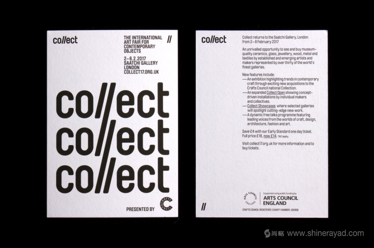
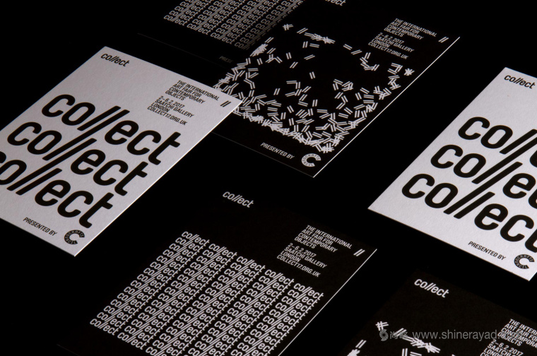
designed by Spin, draws character, play and visual interest from an economical use of a single and fairly austere font, and a black and white colour palette, and went on to include print communication, as documented here, art direction, animation, advertising, signage and environmental graphics.
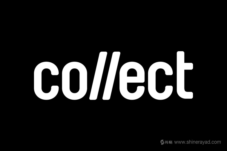
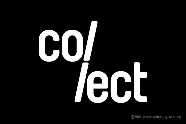
Spin品牌設(shè)計公司為Collect的設(shè)計總體上非??酥?����,但同時非常清晰地表達(dá)了其現(xiàn)代性和對其名字“Collect”的體現(xiàn)����。Logo設(shè)計上面的兩個I的效果非常棒��,斜體的形式把它們和其兩旁的字母區(qū)分開來了。用簡單的視覺連續(xù)地傳達(dá)出主題�。
Spin’s work for Collect
appears as a restrained but distinctive expression of modernity and a play on the name Collect. The logotype’s double l does a good job expressing, in their italicised form and
differentiating the pairing from the characters either side, the theme of collections with a simple visual gesture.
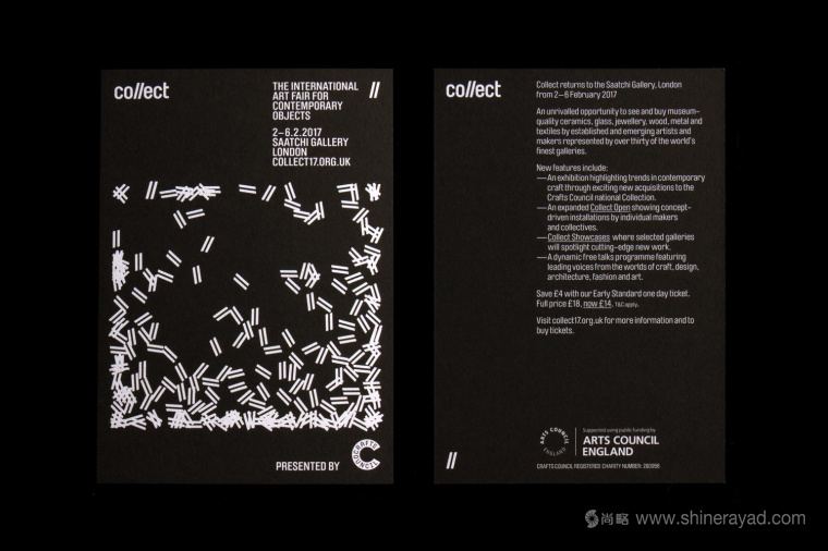
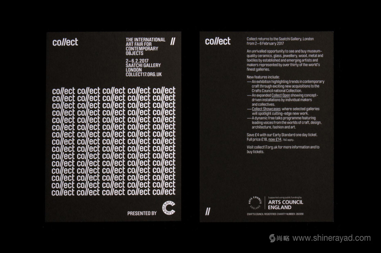
后面的重復(fù)對這個主題有了更進(jìn)一步的表達(dá),印刷制品也成為了非常吸眼的視覺元素�。很容易想象出通過其它幾種不同的形式來表達(dá)�����,無論是靜止的還是運(yùn)動的����,還會有一種上世紀(jì)五六十年代的非小說類書籍封面的現(xiàn)代主義美學(xué)的感覺���。
Repetition furthers this idea, also becoming an eye-catching visual element across print. It is easy to imagine this being expanded in a number of different ways, static and in motion, and evokes a little of the modernist aesthetic of non-fiction book covers from the 50s and 60s.
在這個設(shè)計作品其有限的色彩方案��,字體和圖片的創(chuàng)作中體現(xiàn)了節(jié)制�����。與那些顏色與材質(zhì)的花哨和華麗形成對比,同時與展覽潛在目的保持一致����?��?梢詮腟pin on BP&O了解更多���。
There is a visual economy to the work, in
its limited colour palette and number of fonts, and the creation of image from type. This offers something in the way of contrast to what is likely to be a diverse and ornate show of colour and texture, yet also sharing something in common with the underlying and unifying intentions of the show. More from Spin on BP&O.


尚略廣告��,上海VI設(shè)計公司�����,上海品牌設(shè)計公司��,上海logo設(shè)計公司品牌形象設(shè)計案例點(diǎn)評賞析����。